
It’s been almost three years since I launched my humble website, and I started a front-end coding program around the same time. I’ve learned so much about front-end web development since then, but I realized I coded most of my core pages prior to joining Scrimba in 2023—back when I was a wanderer in “tutorial hell.” From watching YouTube videos and following tutorials, I was not only confused during that period, but I later found out I was using some very outdated practices. Fast forward to today, and I’m in a much better place! I completed a short module on User Interface (UI) over the summer and decided to revamp my portfolio design, if only a little.
I often confuse UI with User Experience (UX). In front-end design, it’s crucial to construct webpages in a way that’s accessible to all, but in this post, I am focusing on updating my site’s design, not necessarily the more intricate parts that make up web accessibility. (Don’t worry, though: my UX adventure is coming soon!)
I wouldn’t say my current site ever failed in the design department, but my original setup seemed dated and in need of some fine-tuning. Take my home page, for example. I used a very dark shade of purple for the navigation header, a dusty pink for backgrounds, and black and white fonts.

Using a contrast checker, these two key colors in my design passed the test, but I decided to modernize and tone down my homepage. I learned early on in my studies that clean color palettes and proper structure are the standard these days. The good news is I adopted most of these practices early on. But it goes without saying that the ‘Wild West’ era of haphazard layouts and graphics that once populated Geocities and AngelFire web hosts in the late 90s and 2000s is long gone. (I’m not going to lie: I miss it!)
Let me be clear that I’m not a designer by trade, so I searched online for portfolio templates for inspiration. This one from Colorlib caught my eye for its simplicity and the way it aligned body text on the left and the image on the right (reversing my original setup!):
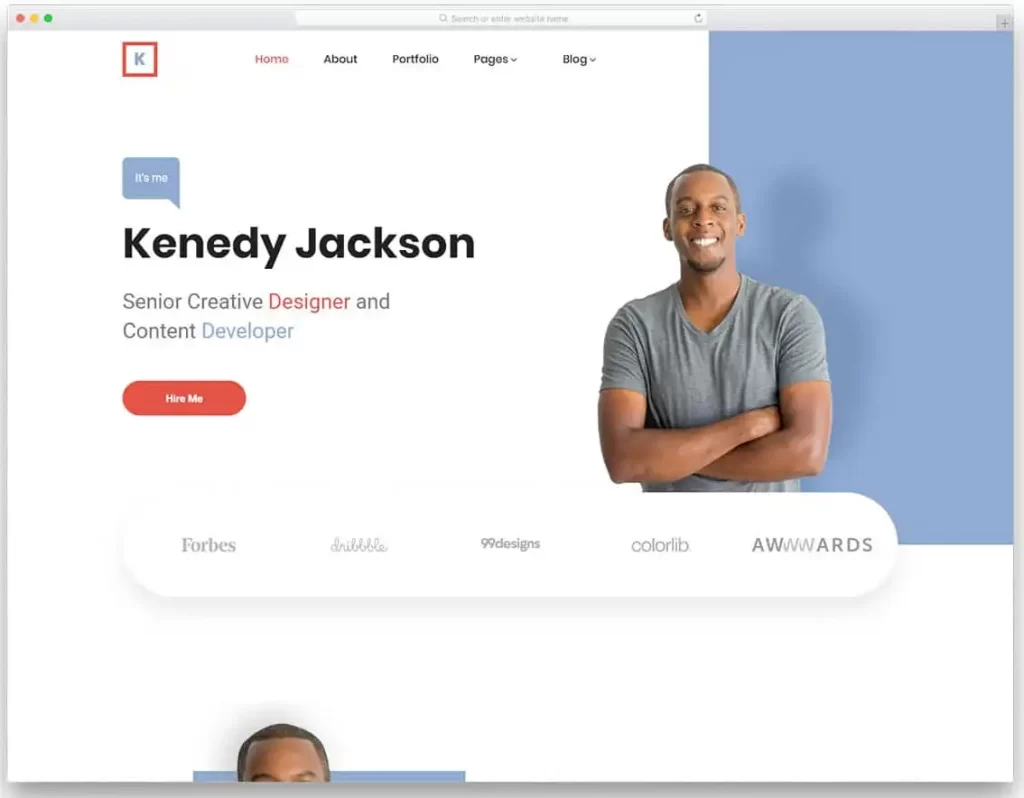
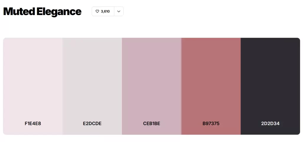
My plan was not to make an exact duplicate of what I found online, but rather create a hybrid of my old design, retaining my main image and refreshing my color palette. Additionally, I explored typefaces on Google Fonts and decided on a new serif for headings and one sans-serif for body text. My choice to use dark purple and rose shades was not fully abandoned. While browsing palettes on Coolors.co, I looked for the familiar—and I certainly found it. ‘Muted Elegance‘ was like a family reunion of sorts.
Though design is not my forte, Figma is synonymous with working with UI. Figma is a platform for designers and developers to sketch out designs for sites and products. Thankfully, I’ve used Figma before in my coding course. I can’t say I was looking forward to it, but I knew that having a prototype of my site would greatly benefit me once I started coding.
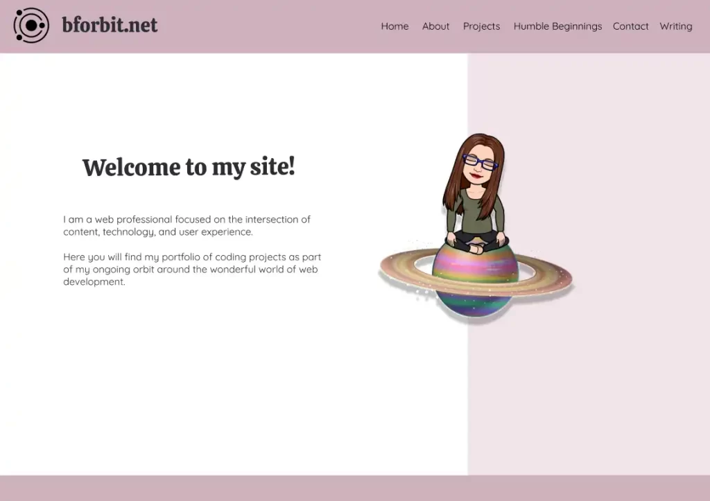

This ended up working as a design playground as I tried to figure out which colors from the Coolors palette would best fit the parts of the page. I placed the darker color in the header and then opted for an off-white shade on the left and a light pink on the right. I used one of the pink/purple variants to accent the footer rather than reusing a dark color as a bookend like I did with my original design. The rosiest shade of the palette made a perfect accent color for my logo, headings, buttons, and hover links. Font colors consisted of a darker shade rather than standard black, and the navigation links contrasted nicely in a lighter pink.
Speaking of the logo, the image and the font used for my site address got an upgrade. The new version looks cleaner and easier to read:


The split color layout decision made me nervous, and I’ll tell you why: I wanted to place my main image over the split, but I wasn’t confident I could keep elements in their place across various browser sizes. What might look decent on my browser may look lopsided on another. This was going to take some research—not to mention trial and error—on my part. Instead of stressing to the max, I could only build this site the only way I knew how: Bit by bit. That’s the bforbit way: b stands for bit. 😉
A grid layout worked much better for this specific layout. As for the image, I kept it from floating away by using a mix of CSS properties like absolute positioning (or as I like to call it: “Hey you! Sit! Stay!“) and adjusting the x and y coordinates with the transform: translate() property. This took me a while to figure out! If you’re reading this and learning to code, don’t feel bad for using Google or AI to help you overcome the hurdles. However, please do as much as you can on your own and take notes along the way. It’s the best way to learn!
On a desktop screen, the layout looked nice. Would a split-color background work on a mobile screen? Probably not. I went back to Figma’s drawing board and brainstormed a proper design for a narrower layout. Gone was the two-column layout; I settled for a singular column instead, placing the image above the text. I wasn’t ready to part ways with my off-white and rose backgrounds, so I figured a linear gradient could create a simple and non-distracting effect:
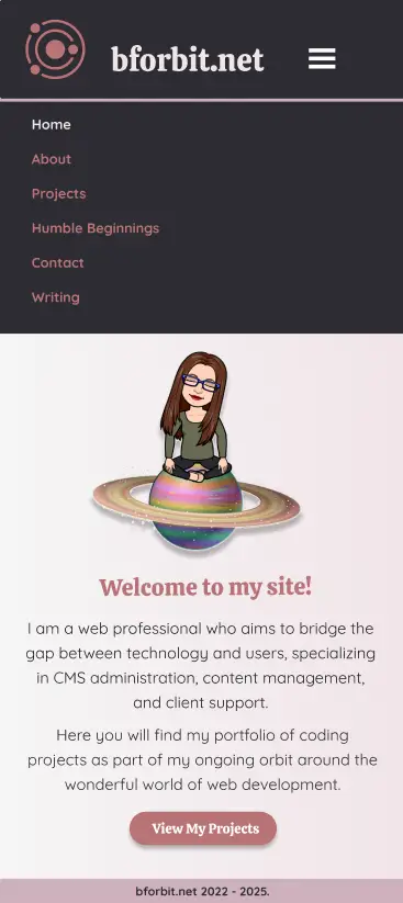
My original mobile design had a stationary vertical navigation bar. At the time, I didn’t know much about JavaScript. Now, though, I had some experience coding a responsive menu that opened and closed with the click of a triple-line ‘hamburger’ button. I went a step further and incorporated a subtle animation when expanding the menu on mobile.
Hey, who invited AI?
I’ll admit, using AI with web page work remains somewhat taboo among web developers. As I hinted before, design is my kryptonite, so when it came to restructuring ‘Humble Beginnings‘—my throwback page dedicated to my early foray into making sites—I sought Google Gemini for a design consultation. The layout suggestions leaned interactive but also standard: think hover-to-enlarge effects on images, vertical timelines, and collapsible elements. None of that appealed to me. Once I gave it a screenshot of my current set-up and expressed a desire for a nostalgic aesthetic, that’s when things started to get interesting:
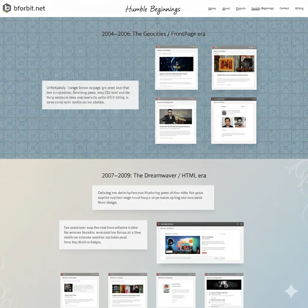
Google Gemini gave me a simple yet fun idea: I could split both eras into sections as before but give them background styling similar to my aesthetic choices from back in the day. In addition, Gemini hinted at a few other subtle touches, like enclosing the screenshots in a retro internet browser frame and switching up the styling slightly in the following era to once again show the design shifts in technology. The above screenshot gave me just enough inspiration to run with the concept:
Before, ‘Humble Beginnings’ was a terribly plain setup with text and images:
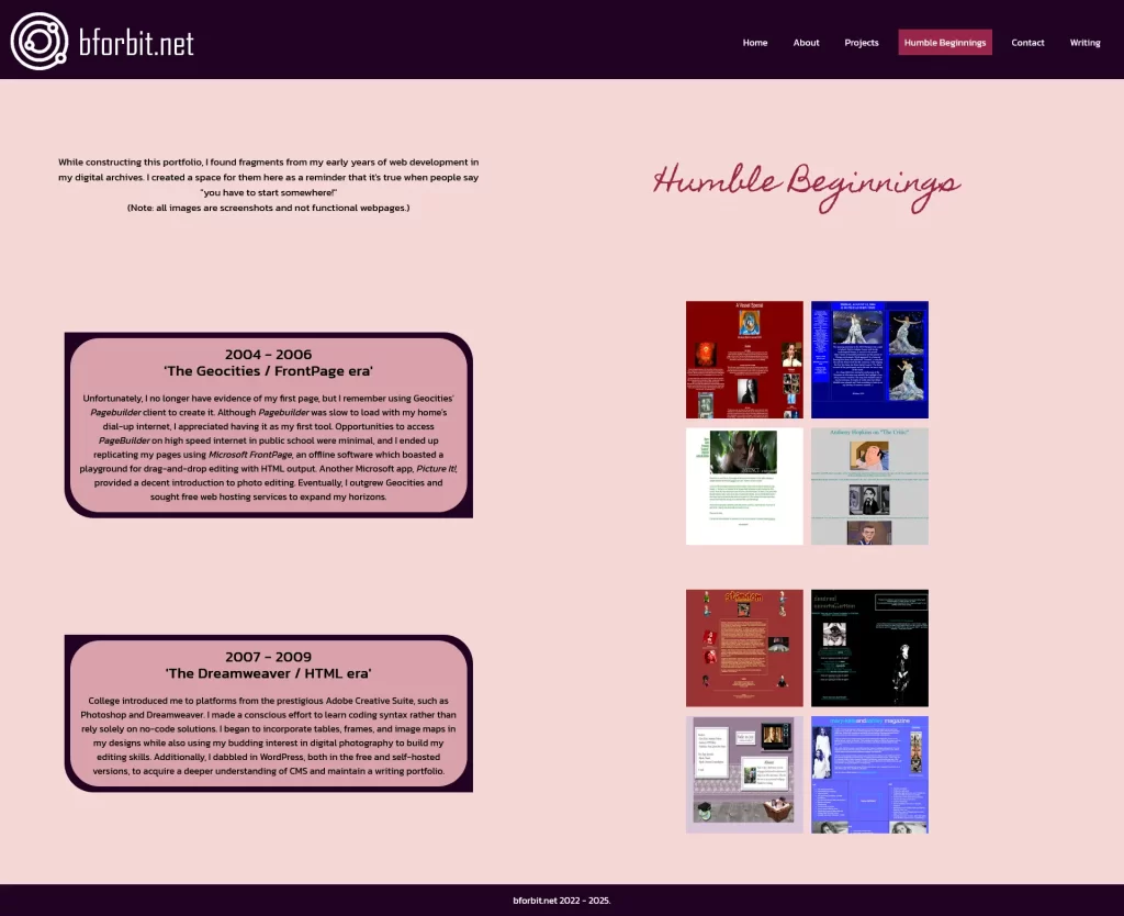
This time around, I attempted to visually take visitors back in time. Now, this page has pizazz without going overboard:
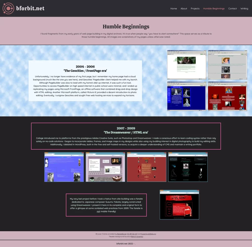
The Technical Stuff
I already knew of additional improvements that had to be made as part of this mini makeover, even if the changes weren’t exactly visible. For one, the images I used on my home page and ‘About’ page were in the PNG format. Though their lossless quality is superior, their file size often leads to slow load times. I made the switch to WebP, and the image sizes decreased by 75%. Behind the scenes, I cleaned up my code: I temporarily removed Schema and better organized the data within the head tag. My CSS code switched up slightly since I learned to use fewer pixel-based sizes, opting for rem and em units for better scalability. I’m still getting used to it.
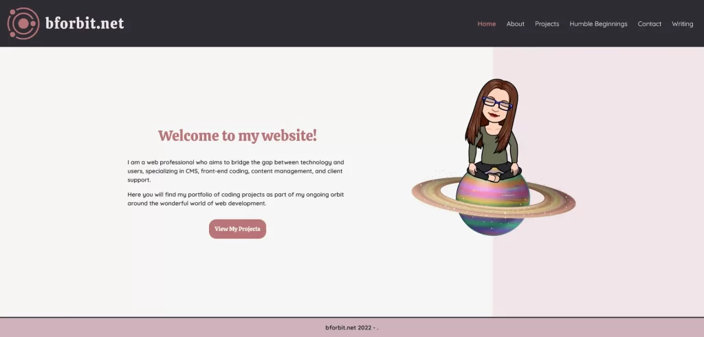
I’d say a UI refresh was just what my website needed. I learned that I didn’t have to make drastic changes. Growth often comes through simple refinements. My muscle memory continues to strengthen while practicing site responsiveness, forming layouts using CSS Grid and Flexbox, and improving performance through optimization and best practices.
And that’s the magic word: practice.
Leave a Reply